10 tips to a better design
I recently had the pleasure of spending some time with publishers, editors and designers at Kevin Slimp's Institute of Newspaper Technology.
It's a kick being with them for a few days. This was my fifth time with the Institute and I hope there will be many more to come.
One of the presentations we set for this year's institute was titled: "Ed's Top 10 Design Tips ... and Maybe More." And here's a chance for me to share some of them with you.
Over the years, these tend to become more or less important. Tip number one may slip to tip number five ... tip number seven may become tip number three. But these are all worth keeping in the top 10 ... for now.
Here they are (in no order of importance):
1. KEEP SCREENS LIGHT over infoboxes, graphics and the like. How light? As light as your press can hold. That way, readers won't have a problem reading the type. And I prefer screens in gray. To my thinking, gray is the ultimate neutral color.
2. KNOW THE DIFFERENCE between tracking and kerning. Tracking is adjusting the space between all letters in the type you've selected, whether it be a word, sentence, paragraph...
Kerning is the adjustment of space between a pair of characters, such as in the word "To."
3. SUGGESTED HEADLINES are OK ... but understand that reporters don't know what configuration you need or how short the headline has to be. Remember, the word here is "suggested." As the designer, you need to rewrite and paraphrase the suggested head to work for your design ... and your readers.
4. CREATE HEADLINE STANDARDS. How many decks of headline can you use in three columns of 48 point? How about one column of 36 point? Or two columns of 42 point? Write them down ... and use them.
5. OUTLAW FUNKY FONTS. No Hobo. No Dom Casual. No University Roman. No Curlz. And never ... ever ... Comic Sans.
6. PROOF YOUR PAGES. To illustrate this point, I showed a tearsheet of a front page weather box that said "Fartly cloudy" instead of "Partly cloudy." Ya gotta check your pages ... and check them again.
7. NIMROD FOR TEXT. Every time someone offers me a look at a "Wow, this is a great text font!" font, I compare it with Nimrod by placing a leg of Nimrod next to it, in the same size and spacing. Nimrod is larger and more readable. Every time. In 27 years ... every time.
8. DITCH OUTLINED TYPE. It looks like something designed in the 1960s. That was fifty years ago. If you want to overlay a headline on a photo, try using a drop shadow behind the headline instead of outlining the headline. More contemporary, more classy.
9. TAKE STUFF AWAY. There's always that temptation to put one more element – a rule, color, another photo – into a design. But the better move is to look for those elements you can remove. You become a better designer with every element you take away from your designs. Simple is best ... less is more.
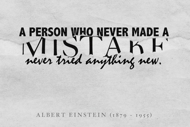
10. MAKE MISTAKES. One of the beauties of newspapering is that we create a new product with every issue. And we get to make new mistakes in every issue. The trick is to not make the same mistake twice. But you'll never grow as a designer unless you give yourself the courage to fail. Without that, you'll never have the courage to succeed.
There are other tips ... lots of them. That's why I do a design hint on my blog every week. I've done hundreds of them ... and there are still hundreds to come.
But if you observe the 10 above, you'll be well on your way to becoming a better designer.
COMING NEXT MONTH! Ed's list of recommended text typefaces! After Ed's recent column on typefaces to toss, many of his readers wrote to ask Ed what typefaces he'd recommend. You'll see it in his next column.
WANT A FREE evaluation of your newspaper's design? Just contact Ed Henninger: edh@henningerconsulting.com | (803) 327-3322
IF THIS COLUMN has been helpful, you may be interested in his books: "Henninger on Design" and "101 Henninger Helpful Hints." With the help of his books, you'll immediately have a better idea how to design for your readers. Find out more about "Henninger on Design" and "101 Henninger Helpful Hints" by visiting his website: www.henningerconsulting.com
ED HENNINGER is an independent newspaper consultant and the director of Henninger Consulting. He offers comprehensive newspaper design services including redesigns, workshops, staff training and evaluations. E-mail: edh@henningerconsulting.com. On the web: henningerconsulting.com. Phone: (803) 327-3322.


