
Front page priorities

Some months ago, friend and follower Roger Ruthhart sent a quick email asking about front page priorities:
"We have been talking about front pages lately and I just wondered if you have ever put together a list of dos and don'ts for effective fronts, or maybe a prioritized list..."
I don't recall having done that previously, but I've given his note a lot of thought in the time since, and I believe I have some suggestions that may be helpful:
DOMINANT PHOTO: I consider this the absolute number one design priority for page 1. A front without a dominant photo (or other visual such as a graphic or map) is a front that fails to draw readers to your newspaper. A secondary but very important point about this element: Place the visual first. Always. Place the visual first.
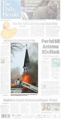
CENTERPIECE: Create a package (often, it's the one with that dominant visual element) that you want your readers to home in on when they first look at the front. This need not be the lead news story, but you want to give your page a strong focus to attract reader attention.
NAMEPLATE: It's a given, but it requires mention here. Make sure your nameplate is large enough so it doesn't get lost – but not so large that it tends to dominate the page. Placing it so there's a bit of space on either side (if it's a traditional centered style) often helps it stand out better.
TEASERS: Take the time to design these well. Teasers thrown in just before deadline just don't do the job. Use visuals that grab attention and write them with verve. You're counting on these to get readers inside your paper – dull, passive visuals and writing won't do here.
LEAD HEADLINE: If your centerpiece is not your news lead, give that lead headline size and strength. A super-bold sans serif typeface, like a condensed black, works well to indicate to readers that the story is a must-read.
NEGATIVE SPACE: Let the page breathe. Allow enough space between packages so readers can clearly distinguish one from the other. I advise at least three picas of space between packages on the front page.
HEADLINE HIERARCHY: A reminder to place larger headlines higher on the page, smaller headlines toward the bottom. But you also want...
A HARD BOTTOM: Don't let the bottom headline on the front page fade into a size that's just too small. I recommend a headline that's at least 36-to-42 point here, to help hold the bottom of the page.
The NECESSARIES: You need a space to contain elements such as your UPC code, weather, contact info, deaths list, an index and the like. I prefer placing this package across the bottom of the page, though it could go in narrow column on the right or left side of the page. Readers – especially new readers – look for this information. Package it tightly but be sure to include it.
Your front page is the face you give your newspaper with every issue. Make sure it's clean, fresh and inviting.
WANT A FREE evaluation of your newspaper's design? Just contact Ed Henninger: edh@henningerconsulting.com | (803) 327-3322
IF THIS COLUMN has been helpful, you may be interested in his books: "Henninger on Design" and "101 Henninger Helpful Hints." With the help of his books, you'll immediately have a better idea how to design for your readers. Find out more about "Henninger on Design" and "101 Henninger Helpful Hints" by visiting his website: www.henningerconsulting.com
ED HENNINGER is an independent newspaper consultant and the director of Henninger Consulting. He offers comprehensive newspaper design services including redesigns, workshops, staff training and evaluations. E-mail: edh@henningerconsulting.com. On the web: henningerconsulting.com. Phone: (803) 327-3322.
Keywords
Henninger, design


