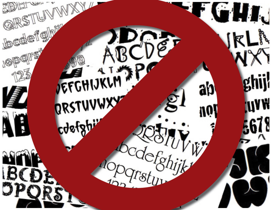
Outlaw funky fonts
 |
| Ed Henninger |
Some call them "decorative." Or "illustrative." Or "expressive."
I call them funky fonts.
These are typefaces like Snowcap. Or University Roman. Or Comic Sans. Or Mistral. Or Barbatrick. Or Typewriter. Or Toolbox. Or Giddyup. Or Critters. Or Curlz. Or Nueva. Or... Or... Or...
They're all funky fonts – and none of them deserves a place in your newspaper.
Funky fonts are: Cheap. Cliché. Dated. Silly. They're also difficult to read. But the real problem with funky fonts is that they tend to draw too much attention to themselves, becoming a dominant part of the design of a page.
If you want to use funky fonts, save them for those advertisers who find them appealing. But let's not use them in our page designs.
Funky fonts may have a place in other publications – like church bulletins or high school yearbooks – but I can't think of a designer for a high-class magazine (Elle, GQ, Vogue and NatGeo come to mind) who would debase a design with a funky font.
A quick story:
Years ago, I was approached by the features editor of a client newspaper on the very morning we were launching a redesign. She showed me her feature front. It included a funky font for a headline.
"No, Amanda," I said. "As of today, we're only using our new headline and accessory typefaces for design elements. No more funky fonts."
"Oh ..." she said, her voice trailing off.
"Tell ya what," I said. "I'm gonna make you a better designer right now, with one simple rule."
"What's that?" she asked.
"No more funky fonts. Not for three months, until I return for my follow-up visit. None!"
"OK," she said. But I could see she wasn't quite convinced.
The launch went well, I left town.
When I returned three months later, Amanda saw me walking in the door. She pointed at me, looked at me purposefully and shouted across the newsroom: "You're right!"
"I know," I said, joking. But I really had no idea what she meant."Tell me how I'm right."
"I'm a better designer than I was three months ago."
"Yes, you are," I said. "I've been looking at your pages in the papers I get mailed to me. But ... you tell me why."
"Because I'm no longer using funky fonts. Now I don't waste my time spinning through that CD of fonts, searching for just the right one – which is often the wrong one. Now I pay attention to the design of the entire page. My designs are better because I'm looking at the whole design, not just one silly font."
I couldn't have been more pleased.
"So," I said, "what did you do with that CD."
"I don't know. I think I tossed it."
End of story.
Wanna become a better designer? Right now? Start today: Never ... ever ... use a funky font again.
WANT A FREE evaluation of your newspaper's design? Just contact Ed Henninger: edh@henningerconsulting.com | (803) 327-3322
IF THIS COLUMN has been helpful, you may be interested in his books: "Henninger on Design" and "101 Henninger Helpful Hints." With the help of his books, you'll immediately have a better idea how to design for your readers. Find out more about "Henninger on Design" and "101 Henninger Helpful Hints" by visiting his website: www.henningerconsulting.com
ED HENNINGER is an independent newspaper consultant and the director of Henninger Consulting. He offers comprehensive newspaper design services including redesigns, workshops, staff training and evaluations. E-mail: edh@henningerconsulting.com. On the web: henningerconsulting.com. Phone: (803) 327-3322.
Keywords
Henninger, design


