
10 news design basics
 |
| Ed Henninger |
A few years ago, I developed the Francis A. Henninger Grant Program, which helps me improve the look of even the smallest newspapers.
From my work on those projects, I've realized that many editors at these papers have hardly any training in proper news design. Many of them are just "winging it," and they'll freely admit it.
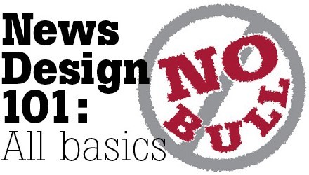
As a result of that realization, I now offer a seminar titled "News Design 101: All Basics. No Bull." The presentation offers those editors an opportunity to learn some of the most fundamental techniques, approaches and practices of good news design.
Many of those who read this column also serve their community newspaper as editor, publisher, reporter, photographer, clerk, janitor, gofer, etc. And they, too, will admit they have little design training. So I thought I'd share some of the tips in that seminar here.
Here's a Top 10 Basic News Design Things You Need to Know:
1. Headline hierarchy. Place larger heads higher on the page. Give your lead news story the largest, boldest headline. Start big, so your smallest head isn't teeny-tiny.
2. Use a dominant photo. Give your lead photo some size. At least three columns. Anything smaller doesn't bring enough impact to the page.
3. Crop photos tightly. Look for the picture in your picture. Rid your photos of cluttered backgrounds and zoom in on your subject.
4. Avoid funky photo formats and frames. No ovals. No notched corners, no colored or embossed frames. We are community newspapers, not high school yearbooks.
5. Use modular design. Keep all the elements and packages on your page in rectangular format. There will be times when you will have to "dogleg" a story around ads, and that's acceptable. But stick to modular design wherever possible.
6. Keep briefs brief. No more than three to four inches. Anything more than that is a story – put a headline on it and place it elsewhere.
7. Align to the baseline. Text and text-like elements such as captions, credits, bylines should all align to a baseline grid. This is easy to set up in your software and it gives your pages a more polished, professional look. It also saves you time trying to force alignment of columns.
8. Keep design elements consistent. Set up standing heads, column sigs, page labels and the like so they are the same throughout your newspaper. Don't fall into the trap of making this-or-that column "different." Eventually, everything becomes different. And ... if everything is different, nothing is.
9. Use software style sheets. This is the easiest way to guarantee long-term design consistency. And it helps speed the design process through every issue.
10. Create a design style guide. This need not be a full-bore, 40-plus page design manual. For small newspapers, it can be only two sides of a sheet of paper. Laminate it and place copies at every design terminal. It will keep you designing in the right direction.
So, there you have it. Follow these 10 tips and yours will be a better-designed newspaper. Now ... and for the long term.
WANT A FREE evaluation of your newspaper's design? Just contact Ed Henninger: edh@henningerconsulting.com or (803) 327-3322.
IF THIS COLUMN has been helpful, you may be interested in Henninger's books: "Henninger on Design" and "101 Henninger Helpful Hints." Learn more at: www.henningerconsulting.com.
Ed Henninger is an independent newspaper consultant and the director of Henninger Consulting. He offers comprehensive newspaper design services, including: redesigns, workshops, staff training and evaluations. E-mail: edh@henningerconsulting.com. On the web: henningerconsulting.com. Phone: (803) 327-3322.
Keywords
Henninger, design


